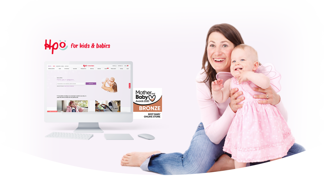
Irokids.gr is the e-shop of IRO brand which serves parents’ needs since 1983, armed with passion and expertise, making each moment a special one.
We were asked to revamp the whole user experience from the ground up with a focus on the following:
- Redesign the website to better resonate with its main user personas and apply the newly redesigned brand identity
- Reduce clutter and improve the navigation design & information architecture
- Design mobile-first to deliver the same user experience seamlessly across devices and focus on content
- Implement new features such as the blog and specific product landing pages that will support future digital marketing campaigns
We always start our projects with a stakeholder workshop and this project was no exception to that. We facilitated a workshop with the client (and the company responsible for the e-shop development & digital marketing) to gather and analyze all existing user behavior data with a deep dive into web analytics. After the workshop, we were able to create an initial model of user flows and common behavioral patterns.
However, we needed to go deeper into users’ needs and problems, thus we decided to talk directly with a sample of the website users, arranging and conducting a series of user interviews so as to understand their perceptions, the problems they faced, their needs and their expectations regarding the redesign of the e-shop.

User interviews revealed valuable insights as we were able to understand the main common pattern of interaction: Most of the users enter irokids.gr having a specific product in mind and they immediately try to search for it without having to browse around. It became clear that the main experience goal was to help users find what they want effortlessly and then simplify the checkout process (1-page checkout). In addition, the findings from user interviews helped us create product-oriented landing pages and a new blog section.
We built high-fidelity, interactive, prototypes for both desktop and mobile devices which were later put to the test by running usability testing sessions with participants that represented the main user persona (new mothers). The main goal of the usability testing was to assess the efficiency (how quickly and easily) of interaction regarding the searching and checkout process.

- “Dominant” search functionality to support the main interaction pattern, i.e. easy and efficient searching for specific products, categories and brands.
- Improved navigation and new content structure addressing the needs of the users.
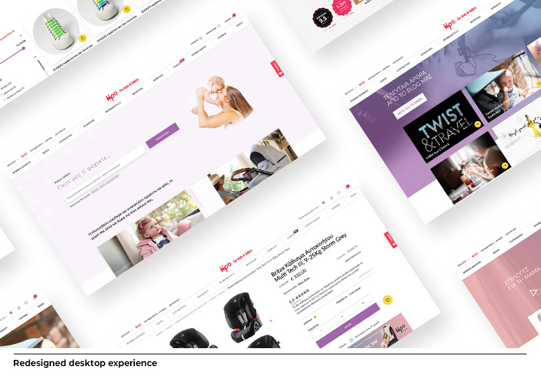
- Fresh, contemporary design highlighting the refreshed branding using a vibrant color palette and appropriate photography so that visitors can further relate with the brand and the content.
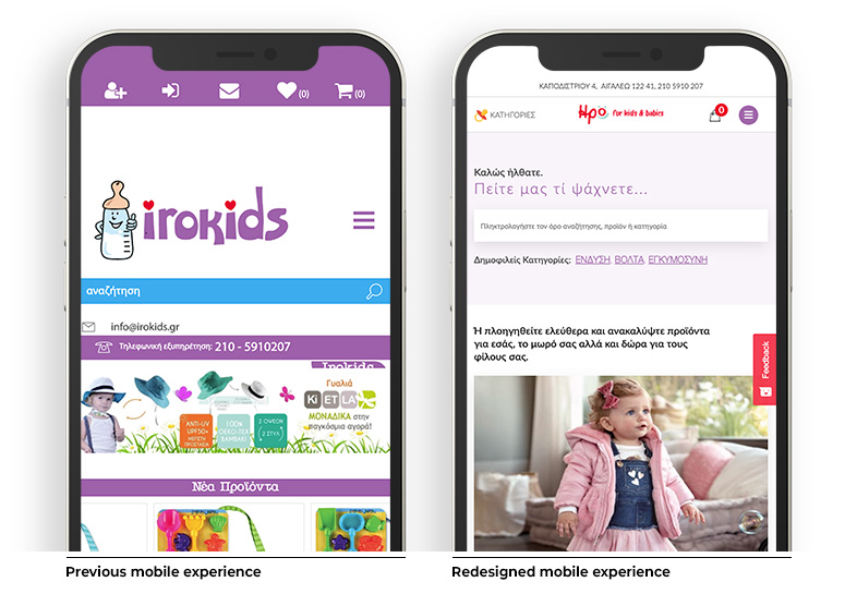
- Completely redesigned mobile experience which is now more content-focused and therefore user-focused.
- Introduced a blog section and product landing pages to promote and support the forthcoming digital marketing campaigns.
Some impressive metrics
- 200% increase in organic visits
- 500% increase in sales from organic visits
- 18.000 daily searches directly from the homepage's search feature
- 2.500 organic clicks per article per month
Awards
Irokids.gr was awarded the Bronze award for Best Baby Online Store at the Mother and Baby Awards 2020 and we couldn't be more proud. We worked closely with the NopServices team to offer a unique e-commerce experience that would meet both our client's business goals and the needs of their end-customers.

- Web analytics review
- User interviews
- User personas
- Prototyping and UI design
- Usability testing